
How to Choose Grout Color for a Flawless Tile Finish
- Justin McCurdy

- Jan 17
- 13 min read
Think of grout as the frame for your tile. It’s a seemingly tiny detail that can completely change the personality of a room. A matching grout color creates a seamless, uniform look, making a space feel larger and more serene. But if you want to make a statement, a contrasting color will highlight each tile's unique shape and pattern, turning a simple wall into a bold design feature.
The Tiny Detail That Makes a Huge Design Statement
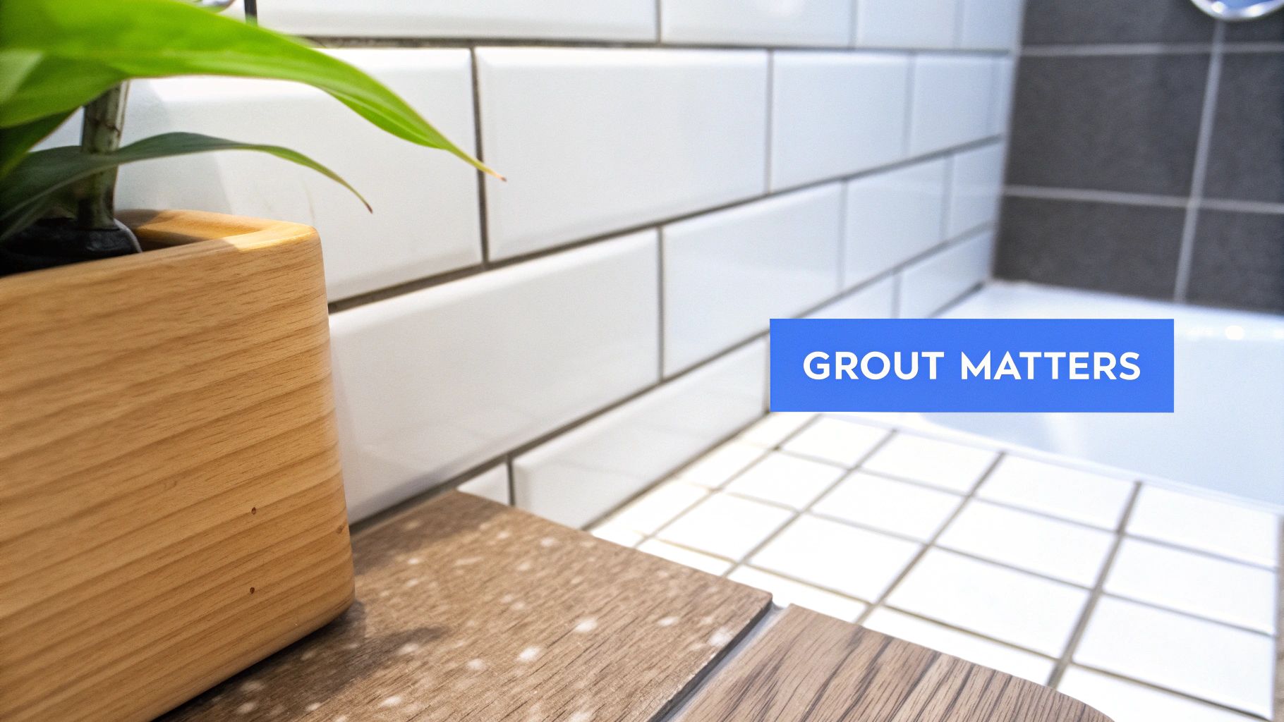
Have you ever walked into a beautifully tiled room and felt that everything just worked? You might not have put your finger on it, but I’d bet the grout was the secret ingredient. It’s what makes your tile the star of the show or helps it blend into a cohesive backdrop.
The right choice can genuinely transform a space. It can make a bathroom feel twice as big, turn a kitchen backsplash into a piece of art, or give a floor a clean, uninterrupted flow.
Don't worry, this isn't as stressful as it sounds. I'm going to walk you through the simple strategies designers use every day. Think of this less as a chore and more as a powerful tool to bring your personal style to life.
It's All About the Vibe
So, do you want the "frame" around your tile to disappear or stand out?
Let’s take a classic white subway tile, for example. Pair it with a dark gray or black grout, and you get that timeless, graphic look that emphasizes the pattern of each individual tile. But use a soft white grout with that same tile, and suddenly the finish is bright, airy, and much more subtle. Seeing these different effects in action can really help, so checking out some of the latest bathroom tile ideas for your dream home is a great place to start.
The goal isn't just to fill the gaps between tiles; it's to complete a vision. This decision is one of the most impactful, yet overlooked, aspects of tile installation. For a deeper dive, this expert guide on choosing grout color is a fantastic resource.
When you’re buying a home with us in communities like White Marsh, Maryland, you don't need to worry about picking grout color. Our professional designers have already curated the best grout pairings for our tile selections, guaranteeing a flawless finish every time.
Even better, I offer my clients unique proprietary visualization tools that help you bring your dream space to life. It completely removes the guesswork and makes customizing your home a fun, hands-on experience.
Mastering the Three Core Grout Color Strategies
Before you get lost in a sea of color swatches, let's simplify things. Most designers really only lean on three main strategies when picking a grout color: matching, contrasting, or going with a neutral blend. Getting a handle on these three approaches will give you a clear roadmap to the perfect look.
Each strategy creates a completely different vibe, and picking the right one is all about the mood you want to set in your space.
The Matching Strategy: For a Seamless, Unified Look
If your goal is a clean, uniform surface that lets the tile itself be the star, matching is your best friend. This approach is exactly what it sounds like: you choose a grout color that's as close as possible to the color of your tile.
The effect is a monolithic, cohesive look that can make a room feel larger and more serene because there are fewer lines breaking up the visual space. It’s perfect when you have a tile with a really interesting texture or a subtle pattern that you don't want to upstage.
Practical Example: Think about using a dark, charcoal-colored grout with natural slate floor tiles. The grout lines practically disappear, creating what looks like one solid, stone-like surface.
Best For: Natural stone, highly textured tiles, or trying to make a small space like a powder room or galley kitchen feel more expansive.
The Contrasting Strategy: For a Bold, Graphic Statement
Want to make your tile pop? This is how you do it. A contrasting grout color is a bold, confident choice that uses a dark grout with a light tile (or vice versa) to really emphasize the shape and pattern of your tile layout. Think of it as outlining each tile to show off its form.
This method is incredibly popular for a reason. In fact, market trends show that 41% of designers are using contrasting grout to create dynamic, eye-catching layouts, especially in modern kitchens and bathrooms.
Practical Example: You can’t go wrong with the timeless look of classic white subway tile paired with a stark black or dark gray grout. That sharp contrast is what makes the iconic brick pattern stand out.
Best For: Creating a focal point, showing off a unique tile shape (like hexagons or fish scales), or adding a vintage or industrial vibe. We’ve got some great examples of this in our guide to choosing the best backsplash tile for your kitchen.
The Neutral Strategy: For Subtle, Understated Definition
If matching feels a little too plain and contrasting seems way too bold, the neutral approach offers the perfect middle ground. This is all about selecting a grout color that's just a few shades lighter or darker than your tile.
The result is a soft, understated definition that adds depth without creating a busy pattern. It gives just enough visual separation to acknowledge the tile's shape while keeping the overall feel calm and cohesive. For a deeper dive, check out this fantastic guide on how to choose grout color for tile like a design pro.
To help you visualize these options, here's a quick breakdown of how each strategy works and where it shines.
Grout Color Strategy At-a-Glance
Strategy | Visual Effect | Best For | Maintenance Tip |
|---|---|---|---|
Matching | Creates a seamless, monolithic look; makes rooms feel larger. | Letting tile texture or pattern be the star; small spaces. | Hides minor stains well, especially with darker colors. |
Contrasting | Highlights tile shape and layout; creates a bold, graphic pattern. | Classic subway tile, unique shapes (hexagon, fish scale). | Light grout shows dirt easily; dark grout can fade. Sealing is critical. |
Neutral | Offers soft definition; adds depth without being overwhelming. | Providing subtle interest; bridging tile and other room colors. | A great compromise—darker neutrals are very forgiving. |
Ultimately, the best choice depends entirely on the aesthetic you're aiming for. Whether you want your tile to blend in or stand out, one of these three strategies will get you there.
Buying a new home with us in communities like Edgewood, Maryland? This is where our expertise really comes into play. Our professional designers have pre-selected ideal grout pairings for every tile we offer, taking all the guesswork out of it for you. We make the decision process easy and ensure a beautiful, expert-approved result every time.
Smart Factors to Consider Before You Choose
You know the basic strategies—match, contrast, blend—but the real magic happens when you get practical. A few real-world factors can completely change which grout color is right for your project, and thinking them through beforehand is the best way to avoid that "what have I done?" feeling after installation.
Let's start with the tile itself. Its size, material, and even the finish have a huge say in the final look. Take a busy, patterned mosaic tile, for instance. There's already a lot going on visually. If you throw a high-contrast grout into the mix, you’ll just create chaos. A much better move is to pick a neutral grout that pulls from one of the tile's background colors. This lets the beautiful pattern shine without having to compete for attention.
Tile Finish and Room Function
The finish of your tile—whether it's matte or glossy—also plays a part. A glossy tile reflects a lot of light, which can make a contrasting grout line look even sharper and more defined. A matte tile, on the other hand, tends to absorb light, often giving the grout a softer, more subtle appearance.
Next, you have to be honest about the room's purpose. That gorgeous, light beige grout might look incredible in a guest bathroom that barely gets used. But in a high-traffic mudroom or on the kitchen floor? It could quickly become a cleaning nightmare. For those busy areas, a mid-tone gray or taupe is often a much more practical choice because it’s a master at hiding daily dirt and grime.
This kind of practical thinking is key to smart home design. It ties directly into how you select materials for your entire house. To dive deeper into this, check out our comprehensive guide on how to choose flooring for your new home.
One of the most common mistakes I see is people underestimating foot traffic. A pristine white grout might look amazing on day one, but if it's in a main walkway, keeping it fresh will feel like a part-time job. You always have to balance the look you want with the life you actually live.
The Impact of Lighting
Never, ever underestimate the power of light! The exact same grout color can look wildly different depending on the lighting in the room. Bright, natural light from a window will show you the color’s true hue. But switch on warm, artificial evening light, and that same grout can suddenly take on a yellowish cast.
Before you commit, you absolutely must see how your potential grout colors look in the actual space throughout the day. Check them in the bright morning sun and again under the soft glow of your evening lamps. This one step can save you from choosing a color that looked perfect at the store but just feels "off" once it's on your walls or floors.
Making this decision often comes down to what you're trying to achieve. This flowchart is a great way to visualize the path to your perfect grout color based on the aesthetic you're going for.
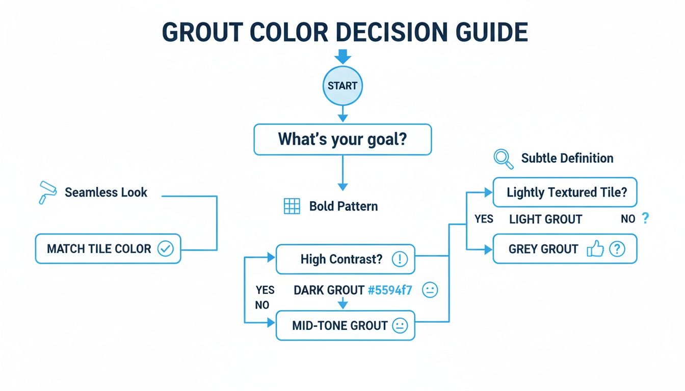
As you can see, if you start with your main design goal—whether it's a seamless look, a bold pattern, or just some subtle definition—you can narrow down your color options pretty quickly.
Using grout as a design element isn't just a niche trend anymore. It’s becoming mainstream. In fact, 33% of commercial spaces now use colored grout to blend function with style, a practice we're seeing more and more in new homes. It’s all part of a larger shift where grout is no longer just a filler; it’s a design star. This helps explain why the global tile grout market is projected to skyrocket to $6.02 billion by 2035.
If you're buying a home with us in Maryland communities like White Marsh or Edgewood, you can relax. Our professional designers have already selected the perfect grout color for each tile package, ensuring a flawless, expert-approved finish every time.
How to Sample and Test Grout Colors The Right Way
Here's a design rule I live by: never, ever finalize a grout color based on a tiny plastic chip or a picture you saw online. It’s the fastest way to end up with a color that looks completely different once it's installed and you're stuck with it.
This part of the process is all about getting hands-on. Your first stop should be the home improvement store for physical samples. Most places sell small grout sample packets or have plastic "color sticks" you can take home.
Once you have them, place them directly between your actual tiles in the room where they'll be installed. This simple move immediately helps weed out the options that just don't work and highlights the frontrunners.
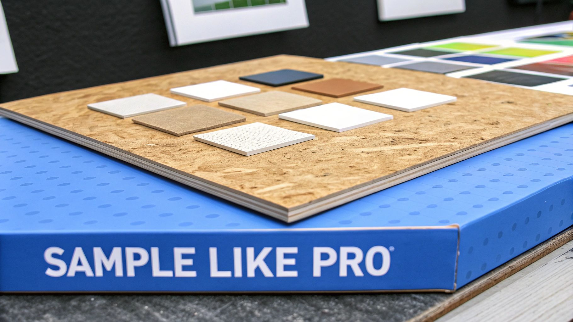
The Secret Weapon: Your Own Sample Board
For the most accurate preview possible, you absolutely need to create a sample board. I tell every DIYer this is a non-negotiable step. It sounds like a big deal, but it's incredibly simple and gives you a real-life glimpse of the final result.
Here’s the quick and easy way to do it:
Grab a small piece of scrap plywood or even some sturdy cardboard.
Glue down four or five of your spare tiles, making sure to leave the same grout joint width you're planning for the actual installation.
Mix up and apply your top two or three grout color choices in different sections between the tiles.
This little board is now your most powerful decision-making tool. You can move it around the room to see how the colors look in the bright morning light by the kitchen window versus the warm, artificial light in your bathroom at night. If you're tackling a major project, our guide on how to plan your bathroom remodel can help you keep all these little details organized.
Pro Tip: Let the grout on your sample board dry completely—for at least 24 hours. Wet grout is always several shades darker than its final, cured color. This is the single biggest mistake people make, and a little patience here is the key to avoiding a huge post-installation surprise.
Leaning on an Expert Eye
While testing is crucial for any DIY project, it's also a perfect example of where professional guidance really shines. When you buy a new home with us in communities across Baltimore County, Maryland, and Harford County, Maryland, this is one of those details you won't have to stress over.
Our design team has already done the heavy lifting, curating the most beautiful and appropriate grout colors to pair with every tile selection we offer. It’s all part of the seamless experience we want our clients to have.
Even better, I give my clients access to proprietary visualization tools that let you see exactly how the tile and grout will look together in your new space. It takes all the guesswork out of the process and ensures you get a stunning, cohesive result you’ll love for years to come.
Enjoying the Design Process Without the Guesswork
Feeling a little overwhelmed by all the grout color options out there? I get it. Staring at a wall of color sticks can feel like a pop quiz you didn't study for. But this is exactly where having an expert in your corner can turn a stressful decision into one of the most exciting parts of designing your new home.
When my clients in communities like White Marsh, Maryland and Edgewood, Maryland pick out their flooring, countertops, and tiles, the next step isn’t a headache—it’s a sigh of relief. With our homes, you don't need to worry about picking grout color when selecting tile because our professional design people have already chosen the best color for you.
A Curated, Expert-Backed Approach
Here’s our secret: for every single tile we offer, our design team has already expertly paired it with the perfect grout color. This isn't about limiting your choices; it's about eliminating the bad ones. It’s a curated approach that guarantees a stunning, cohesive look every single time.
You never have to worry about picking a color that looks great on a tiny sample chip but ends up clashing horribly once it's on your floor.
This process really gives you the best of both worlds:
You get all the fun of personalizing your space by choosing the tile that perfectly captures your style.
You get the confidence of an expert-backed choice, knowing the grout is going to complement it beautifully.
It’s all about making the design process enjoyable, not intimidating. We focus on guiding you toward a fantastic outcome without all the guesswork.
The goal is to let you enjoy the creative journey of customizing your home. My proprietary visualization tools are a huge part of this, as they let you see exactly how the tile and grout will look together in your specific room, long before installation begins.
This is a core part of the hands-on service I provide for my clients throughout Baltimore County, Maryland, and Harford County, Maryland. It’s a supportive process designed to bring your vision to life flawlessly, ensuring every last detail helps create a home you'll absolutely love.
If you’re ready to buy a home where these details are handled with expert care from day one, I’d love to show you how we can make that happen.
Common Questions I Get About Grout Color
Even with all the strategies and samples, a few key questions always seem to surface. Let's walk through some of the most common ones I hear from homeowners. Getting these answers straight will give you that last bit of confidence you need to lock in your choice.
What’s the Go-To Grout Color Everyone Loves?
If there’s one clear winner, it’s a light gray. It's consistently the most popular and flexible choice, and for good reason. It gives your tiles just enough definition without being as jarring as black or as tough to keep clean as a bright, pure white.
Shades like 'Silver' or 'Oyster Gray' are incredibly versatile. They look just as good framing classic white subway tile as they do next to a bold, colorful pattern. The best part? They’re pros at hiding a bit of everyday grime, which makes them a practical and stylish pick for busy spots like kitchens, entryways, and mudrooms.
Should Grout Be Lighter or Darker Than My Tile?
This is all about the vibe you're going for. There’s no single right answer here—just what’s right for your space and your vision.
Want a bold, graphic statement? Go for contrast. Dark grout with light tiles (or the other way around) makes each tile pop, really playing up the pattern and shape.
Hoping for a seamless, unified look? Find a grout color that's a near-perfect match to your tile. This makes the grout lines fade into the background, creating the illusion of a single, continuous surface.
Looking for a happy medium? Choose a grout that’s just a few shades different, either lighter or darker. This gives you some soft definition without stealing the show.
How Do I Pick a Grout for Wood-Look Tile?
When you’re laying wood-look tile, the whole point is to make it look like real hardwood, right? The secret is in the grout. To pull off a convincing look, you'll want to choose a dark grout that matches one of the darkest tones you see in the tile's grain.
This little trick makes the grout lines all but disappear, just like the super-tight seams you'd find between actual wood planks. Definitely steer clear of light or contrasting colors here—they’ll just draw attention to the grid and ruin the illusion.
The global grout colorant market, valued at $0.5 billion in 2024, is exploding precisely because homeowners are getting creative with color. This market is expected to more than double, hitting $1.2 billion by 2034, proving just how much a simple color choice can transform a room. You can explore more data about these market trends and see how they're shaping new construction.
Can Grout Color Really Make a Room Feel Bigger or Smaller?
It absolutely can! It's wild how much grout can influence the perception of a space.
Using a grout that matches or blends closely with your tile creates a smooth, unbroken surface. This visual trick can make a room feel noticeably larger and more open. When the eye isn't stopping at a bunch of grid lines, the whole area just feels more expansive.
On the flip side, a high-contrast grout creates a very clear grid pattern. This can make a space feel a bit busier and, in some cases, a little more cramped.
At Customize Your Home, we live and breathe these kinds of details. Our professional design team takes the guesswork out of it by pre-selecting the perfect grout color for every tile we offer. It's just one way we ensure buying your dream home in communities across White Marsh, Maryland; Edgewood, Maryland; Baltimore County, Maryland; and Harford County, Maryland is a seamless experience.
If you’re ready for a home buying process where every detail is handled with expert care, come see what we're all about at https://www.customizeyourhome.com.
Comments