
How to Choose Exterior Paint Colors: Practical Tips for Curb Appeal
- Justin McCurdy

- Jan 12
- 15 min read
Choosing an exterior color can feel like a massive commitment, can't it? It's the very first thing people see, the handshake your home gives the world. The real secret isn't just picking a "nice" color; it's about giving your home a personality that truly feels like you. It's time to move beyond the safe, predictable choices and find a look you'll absolutely love coming home to every single day.
Your Home's Personality Starts With Color
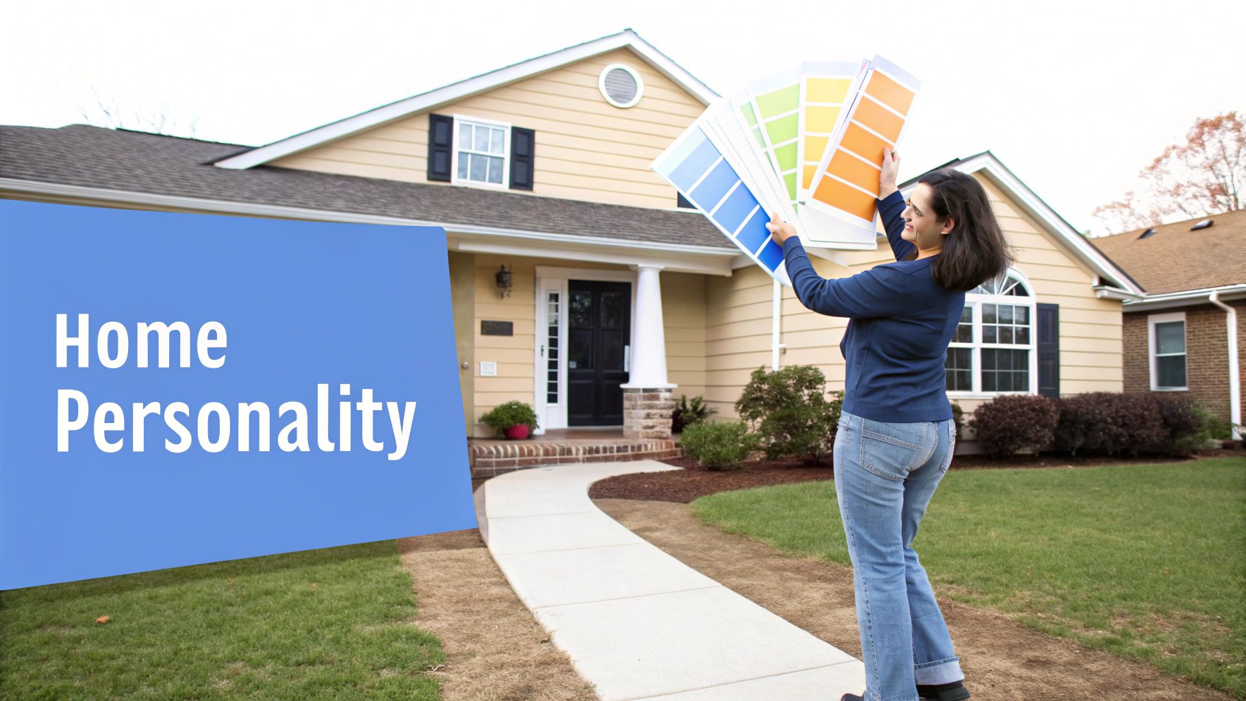
Let's take the stress out of this and make it fun. Think of your home's exterior as a blank canvas. The color you choose sets the entire mood and tells a story. This is your chance to craft a look that's all you, whether you’re settling into a new community in White Marsh or a quiet spot in Harford County.
The world of exterior paint has changed dramatically over the last ten years. We've thankfully moved past the era of endless "Builder Beige." Now, we're seeing a fantastic shift toward more interesting palettes—think warm, creamy off-whites, sophisticated beige tones, and rich, earth-inspired hues. This isn't just about following trends; it’s about homeowners wanting to create architectural distinction that reflects their personal style while still feeling timeless. It’s clear that choosing a color is no longer about just blending in.
Finding Your Color Inspiration
Before you even touch a paint swatch, let your mind wander and start gathering ideas. What kind of look are you naturally drawn to? Are you a fan of the crisp, clean lines of a modern farmhouse, or do you prefer the warm, inviting feel of a classic colonial?
Here are a few practical ways to get the ideas flowing:
Take a drive. Seriously, just explore. Cruise through different neighborhoods in Baltimore County or Edgewood and pay attention to what makes you stop and look. What color combinations catch your eye, and more importantly, why? For example, you might notice a classic brick home looks amazing with deep navy shutters and cream trim.
Look to the landscape. Nature rarely gets it wrong. The colors found right here in Maryland—from the deep greens of the forests to the stony grays of the riverbeds and the warm, earthy browns of the soil—are always a solid bet.
Play with technology. This is where I love to help my clients. Instead of just guessing, I offer unique proprietary visualization tools that show you exactly how different colors will look on your specific home. It’s a total game-changer for feeling confident in your decision.
The goal is to land on a color palette that not only looks beautiful but feels like a natural extension of your personal style. It’s about creating that feeling of being truly home from the moment you pull into the driveway.
Of course, a stunning exterior is about more than just the siding color. The trim, front door, and even landscaping all play a part in that first impression. For additional tips for enhancing your home's curb appeal, you can find some great ideas from other home improvement pros.
The Low-Maintenance Advantage: A Home That Never Needs Painting
What if you could have that perfect, beautiful exterior with virtually zero upkeep? This is where modern home building really shines. The homes I represent are built with low maintenance as a top priority. Instead of materials that require constant painting, we use high-quality vinyl siding and rot-free materials like Azek.
This means you get that beautiful, lasting finish you love from day one, without ever having to pick up a paintbrush in the future. Imagine your home looking freshly painted for decades to come. It's a smart approach that saves you a ton of time and money down the road, giving you more freedom to simply enjoy your home.
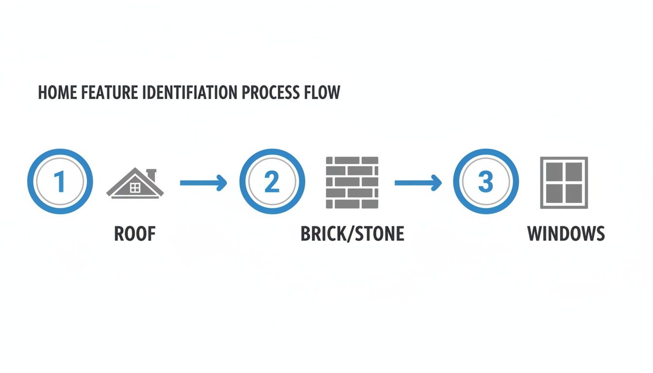
Work With Your Home's Unchanging Features
Before you fall in love with a paint swatch, take a good, hard look at your house. I'm talking about the parts that aren't going anywhere—the "fixed elements." These are the bones of your home's exterior: the roof shingles, any brick or stone accents, the color of your window frames, and even the driveway.
These features are your starting point, your non-negotiables. They dictate what will work and what will clash, and ignoring them is the fastest way to an exterior that just feels... off.
Listen to Your Home's Undertones
Every one of those fixed elements has an undertone—a subtle, underlying color that leans warm, cool, or neutral. Nailing this is probably the single most important part of getting your color palette right. It’s like trying to put a puzzle together; if the undertones don't match, the pieces won't fit.
For instance, that classic red brick you see on so many homes in Baltimore County and Harford County has strong orange or terracotta undertones. It’s warm. If you try to pair it with a stark, cool blue-gray, it’s going to look jarring. But, lean into it with a warm off-white, a deep earthy green, or a beautiful warm greige, and suddenly the whole look comes together beautifully.
The secret is to stop fighting your home's permanent features and start working with them. When your colors harmonize with the existing undertones, the entire exterior feels cohesive and professionally designed.
Let's break it down with some real-world examples:
Warm Tones: You've got a roof with brown or reddish-brown shingles and some warm, sandy-colored stonework. Your palette is warm. Look for colors with yellow, beige, or red undertones. Think creamy whites, rich tans, and even deep olive greens.
Cool Tones: Your home has a dark gray or black roof, crisp white vinyl windows, and cool gray stone accents. These are your cool-toned features. They pair perfectly with colors that have blue or purple undertones—think crisp light grays, deep navy blues, or a soft slate blue.
Of course, if your home features other materials, proper upkeep is still key. For example, knowing the ins and outs of cedar siding care and maintenance can make all the difference in its longevity.
How to Build a Complete Exterior Color Palette
A truly stunning home exterior isn't about finding one perfect color—it's about creating a team of colors that work in harmony. I always think of it as a three-part system: the main body color, the trim, and a pop of accent for the fun stuff like your front door. Nailing this balance is what gives a home that polished, professionally designed look.
A great starting point that designers have used for years indoors is the 60-30-10 rule, and it works beautifully for exteriors too. It's a simple framework for creating a palette that just feels right.
60% Main Body Color: This is your big-picture color, the one covering most of the siding. It sets the entire mood for your home.
30% Secondary Trim Color: This one is all about highlighting your home’s best features—the window trim, fascia boards, and door frames. It should either contrast with or complement the main color.
10% Accent Color: Here’s where you get to show off your personality! It’s used sparingly on the front door or shutters to catch the eye and add a little character.
Putting the 60-30-10 Rule into Practice
Let's walk through a real-world example. Picture a modern farmhouse-style home. A really popular and timeless choice right now is a moody, dark gray for the main siding (60%). It feels sophisticated and substantial.
For the trim (30%), a crisp, clean white creates a sharp contrast that makes all the architectural lines pop. This keeps the dark gray from feeling too heavy and gives it that classic, clean look.
Finally, for that 10% accent, a bold, welcoming front door in a deep red or even a cheerful sunny yellow adds the perfect finishing touch. It’s a small detail that makes a huge impact, basically saying, "Welcome in!"
This whole process starts by identifying the key features of your home that aren't changing—the roof, any brick or stone, and the window frames. Those are the foundation of your palette.
As you can see, thinking through your home's permanent elements first is the key to making sure every color you choose works together for a cohesive final look.
To give you a head start, here’s a quick guide to some popular color combinations that work well for various home styles.
Popular Exterior Color Palette Combinations
Palette Style | Main Body Color Idea | Trim Color Idea | Accent Color Idea (Door/Shutters) |
|---|---|---|---|
Classic Farmhouse | Crisp White | Black or Dark Gray | Natural Wood Tone or Barn Red |
Modern Moody | Deep Charcoal or Navy | Off-White or Light Gray | Bright Yellow or Teal |
Earthy Craftsman | Warm Taupe or Olive Green | Cream or Beige | Deep Burgundy or Forest Green |
Coastal Cottage | Light Sky Blue or Seafoam | Bright White | Coral or Navy Blue |
These are just ideas, of course. The goal is to find a combination that feels like you and complements your home's unique style.
What Your Front Door Color Says
Your front door is the true focal point of your home's exterior—it's the perfect spot to make a statement. The color you choose can say a lot about the home (and people) inside.
Red: A classic for a reason. It signals warmth, welcome, and vibrant energy.
Blue: Conveys a sense of calm, trust, and stability. A deep navy or slate blue is always timeless.
Yellow: Radiates happiness and optimism. It’s an instant mood-lifter for anyone walking up to your home.
Black: Represents elegance, strength, and a touch of formality. It’s a sophisticated choice that never goes out of style.
Choosing these elements is one of the most exciting parts of bringing your new home to life. For more ideas, you can dive into our comprehensive home color guide to find inspiration for a palette that’s all you. With my hands-on help and proprietary visualization tools, we'll bring that vision to life together.
What If You Never Had to Paint Your House Again?
Picking out the perfect exterior paint color is definitely one of the most exciting parts of owning a home. But what if you could nail that beautiful look you love and then… never have to think about painting again?
It might sound too good to be true, but it’s a reality for the families I help in communities like Edgewood and all over Baltimore County.
I represent a builder who construct homes with your long-term peace of mind at the very center of the process. It's not just about how a house looks the day you get the keys. We're focused on how it will look and perform for decades, with as little work from you as possible.
Built for Life, Not for Maintenance
The secret is all in the materials that buyers can choose.
For siding, buyers can select premium, high-quality vinyl that comes in a whole spectrum of gorgeous, fade-resistant colors. You get that rich, fresh look from day one, and it stays that way year after year. No more chipping, peeling, or fading that inevitably comes with a painted surface.
Then, for the trim, soffits, and other exterior details—those spots that take the biggest beating from the weather—we use advanced, rot-free materials like Azek. This is a super-durable PVC product that is completely impervious to moisture. It simply won’t warp, crack, or rot like wood can, which means you can officially say goodbye to those weekend maintenance projects.
Choosing a home built with these modern, low-maintenance materials saves you thousands of dollars in future painting costs and countless hours of your own time. It’s an investment in your lifestyle, giving you more freedom to actually enjoy your new home.
The Financial Upside of a Paint-Free Home
Let’s be honest, it really comes down to the numbers. The average cost to have your home’s exterior professionally painted can run anywhere from $3,000 to over $7,000. And that’s a job you’ll have to do every 5 to 10 years, depending on your climate and the quality of the last paint job.
Think about that over the life of a 30-year mortgage. You could easily be looking at $15,000 to $40,000 or more in repainting costs alone.
When you opt for a home built with a maintenance-free exterior, that’s money that stays right in your pocket. You get the perfect color combination from the start, and it’s locked in for the long haul. When looking into durable and stylish options, you might also consider various alternative exterior coatings that can protect and beautify your home.
This is exactly why I provide my clients with unique visualization tools. We can play with all the kitchen and bath color combinations on your exact home model, letting you see your vision come to life so you can feel 100% confident in your choices. It’s all about designing a home that not only looks incredible but also works smarter for you and your family.
Ready to see how a low-maintenance home can fit your lifestyle? Let’s connect and I can walk you through the customization options available in our beautiful Maryland communities.
Testing Colors the Right Way
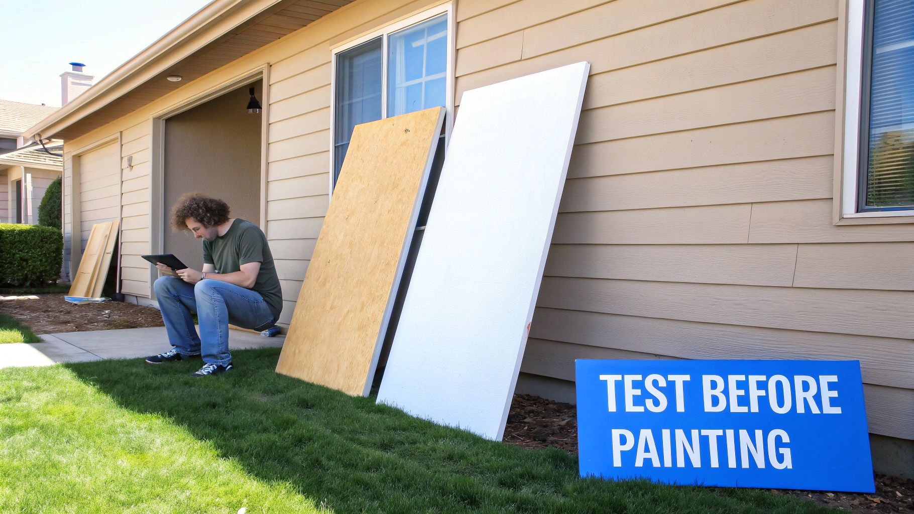
If there's one piece of advice I drill into every client, it's this: never, ever choose an exterior paint color from a tiny paper chip under the harsh fluorescent lights of a hardware store. It’s the single fastest way to end up with a color you can't stand.
That little swatch can look completely different once it’s scaled up on a huge wall and bathed in natural sunlight. I've seen it happen a hundred times—a soft, gentle gray from the store suddenly flashes baby blue in the morning sun or turns into a dull, flat beige in the afternoon shade. Getting this part right is absolutely critical.
Go Big with Your Samples
First things first, you have to move beyond those little paper swatches. You need to see your top contenders in a much larger format to get a real feel for how they’ll look and behave. Tiny chips just don’t have enough surface area to show a color’s true character and, more importantly, its sneaky undertones.
Instead of taping paper to your wall, I always recommend one of two methods:
Peel-and-Stick Samples: Companies like Samplize offer large, 9x12 inch peel-and-stick samples made with genuine paint. They’re a fantastic, mess-free way to test colors, and you can easily move them around to different spots on your house.
DIY Sample Boards: The old-school method still works great. Grab a few pieces of foam board or even just large sheets of cardboard. Paint them with two full coats of your sample color, making sure to leave a white border around the edge. That little bit of white space prevents your current exterior color from tricking your eyes.
This approach lets you see how the color truly behaves on a larger scale, which is essential for making a final, confident decision.
The Power of Visualization
Physical samples are a must for existing homes, but what if you're selecting finishes for a new home and could skip the guesswork entirely? This is where my hands-on service really makes a difference for my clients. I provide access to some pretty incredible proprietary visualization tools that take all the anxiety out of the process.
This technology lets you experiment with total confidence. You get to see exactly how your final choices will look before any decisions are locked in. Think of it as a crystal ball for your home's interior, ensuring the vision in your head matches the final result perfectly.
Location, Location, Location
Once you have your large samples, the real test begins. You need to watch them throughout the day, as the look of a color can change dramatically from morning to evening.
Take your sample boards and place them on different sides of your home. You need to see how they react to the changing sun.
East-Facing Walls: Get that bright, direct morning light.
West-Facing Walls: Will be drenched in the warm, almost orange-hued light of late afternoon.
North-Facing Walls: Stay in the shade most of the day, which has a tendency to bring out a color's coolest undertones.
South-Facing Walls: Get consistent, direct light all day, which can make colors appear much brighter and lighter than they are.
Pay close attention to how the color looks not just in direct sun but also in the shade. Does it still hold its character, or does it completely wash out? This simple test prevents so many unpleasant surprises down the road. For buyers in our White Marsh, Edgewood, and Baltimore County communities, this means you can choose your dream home finishes knowing the final look will be exactly what you envisioned.
Today's Trends and Timeless Classics
Everyone wants a home that feels fresh and modern but won’t look dated in five years. It’s the ultimate balancing act, right? You want to embrace what's new and exciting without committing to a color that will scream "2024" a decade from now.
The good news? Current trends are actually making this easier than ever. We're seeing a huge move away from the stark, cold grays that dominated for years. Instead, the spotlight is on sophisticated, earthy tones that feel both contemporary and classic. Think warm khakis, deep forest greens, and moody, muted blues. These colors give a home a calm, luxurious vibe that has serious staying power.
Why Earthy Tones Are Taking Over
There's a good reason these nature-inspired shades are winning over designers and homeowners alike. For one, they’re incredibly versatile. An earthy green or a rich tan looks just as stunning on a modern farmhouse as it does on a traditional colonial. They also connect a home to its natural surroundings, which is a big deal in beautiful areas like Harford County.
These colors are also masters of disguise when it comes to everyday dirt and dust, and they pair beautifully with natural materials like stone, wood, and metal accents. They just feel grounded and welcoming—a feeling that never goes out of style. You can see more on how these natural elements are shaping design in our guide to the top home design trends for 2024.
The industry is backing this up. Paint giants like Sherwin-Williams and HGTV Home jointly named Universal Khaki their Color of the Year—a perfect, earthy mid-tone tan. Look at any of the new color collections, and you'll see palettes built around warmth and simplicity: neutral browns, off-whites, and deeper tones like burgundy, reddish terracotta, blues, and greens. It's a clear signal of where design is headed, as noted in this look at color trends and real estate on NAR.realtor.
Making Trends Timeless for Your Home
So, how do you use a trending color without it feeling like a fleeting fad? The trick is to build a timeless palette around it. Even if you fall in love with a trendy dark green for your siding, pairing it with classic trim and accent colors ensures the whole look will age gracefully.
Here are a few popular yet timeless combinations I often recommend:
Deep Moody Blue: Paired with a creamy, warm off-white trim and a natural wood-stained front door. This look is pure sophistication and will never feel outdated.
Warm Greige or Khaki: Matched with crisp white trim and bold black accents on shutters and hardware. It’s a clean, classic, and incredibly flexible palette.
Earthy Olive Green: Complemented by a soft tan or beige trim. This combo creates a rich, organic look that feels both warm and inviting.
The ultimate goal is to choose a color that feels exciting to you today but is grounded in a classic sensibility that will maintain its elegance and value for years to come.
The Low-Maintenance Advantage
Of course, the best color is one you don't have to constantly worry about. The homes I help clients find in places like White Marsh and Edgewood are built with low maintenance as a top priority. Instead of paint, buyers can choose high-quality vinyl siding that comes in a wide array of these beautiful, on-trend colors. For trim, they use rot-free materials like Azek that hold their color and integrity for decades.
This means you can choose that perfect, trendy-yet-timeless color palette and never have to spend another weekend on a ladder with a paintbrush. It's the smarter way to get a look you love—one that's truly built to last. Ready to explore a maintenance-free future? Let’s talk about how my unique visualization tools can help you design your dream home.
A Few Final Questions About Exterior Colors
As we wrap up, let's tackle a few questions that I hear all the time from clients. Thinking through these last few details can really solidify your decisions and give you confidence in the final color palette you’ve chosen.
How Many Colors Is Too Many for an Exterior?
I almost always steer my clients toward a three-color palette. It's a classic for a reason. You've got your main field color for the siding, a second color for the trim, and a third accent color for the front door or shutters. It just works.
This combination gives you enough variety to create depth and interest without making the house look chaotic or overly busy. For example, a crisp white siding, black trim, and a natural wood door is a perfect three-part harmony. Sure, a grand Victorian with tons of gingerbread trim might handle four or five colors, but for most modern homes, three is the magic number for a clean, cohesive look.
Do My Interior and Exterior Colors Have to Match?
Not at all! You don't need to use the same exact shades, but it's a good idea for them to feel related. Think of your exterior as the book cover—it sets the tone for the story inside. Most of our homes already have the exterior colors chosen by us making this process much less stressful.
For instance, if you have a warm, earthy exterior with sage green siding and cream trim, it would feel natural to walk into an interior with warm neutrals, wood accents, and maybe some green plants. When I help buyers customize their homes, we select flooring, countertops, and cabinets that create this exact kind of seamless flow. The key is creating a smooth, harmonious transition, not a carbon copy.
How Much Should the Neighborhood Influence My Choice?
This is a big one. While your home should absolutely be a reflection of your personality, it doesn't exist in a vacuum. You want it to stand out for the right reasons, not stick out like a sore thumb.
Take a slow drive through your new community, whether it's in Baltimore County or Harford County, and just observe. What color combinations catch your eye in a good way? You're not looking to copy anyone, but to find a palette that complements the neighborhood's overall vibe. This is especially important if you have an HOA with specific guidelines. The goal is to create a home that feels both personal and perfectly placed.
My goal is to provide helpful content for everyday home living. While the builder I represent provides high-quality homes, I go a step further—offering my clients unique proprietary visualization tools, hands-on service, and access to visualizers that help you bring your dream space to life. We let buyers customize their homes by getting to pick their flooring, countertops, cabinets, tile, and of course, the perfect exterior look.
Ready to see what’s possible in White Marsh, Edgewood, Baltimore County, or Harford County? Let’s start building the home you’ve always wanted. Visit us at https://www.customizeyourhome.com.
Comments