
How to Choose Paint Colors: Your Ultimate Guide to a Beautiful Home
- Justin McCurdy

- Oct 21, 2025
- 14 min read
Picking a paint color can feel like a massive commitment, right? But I'll let you in on a little secret: it's actually simpler than it seems. The trick is to stop staring at endless paint chips and start looking at your room—its unique light, the floors you have, and the furniture you love.
The perfect shade isn't just a pretty color; it's the one that feels right in your space, setting the stage for your life.
The Secret to Choosing Paint Colors You Love
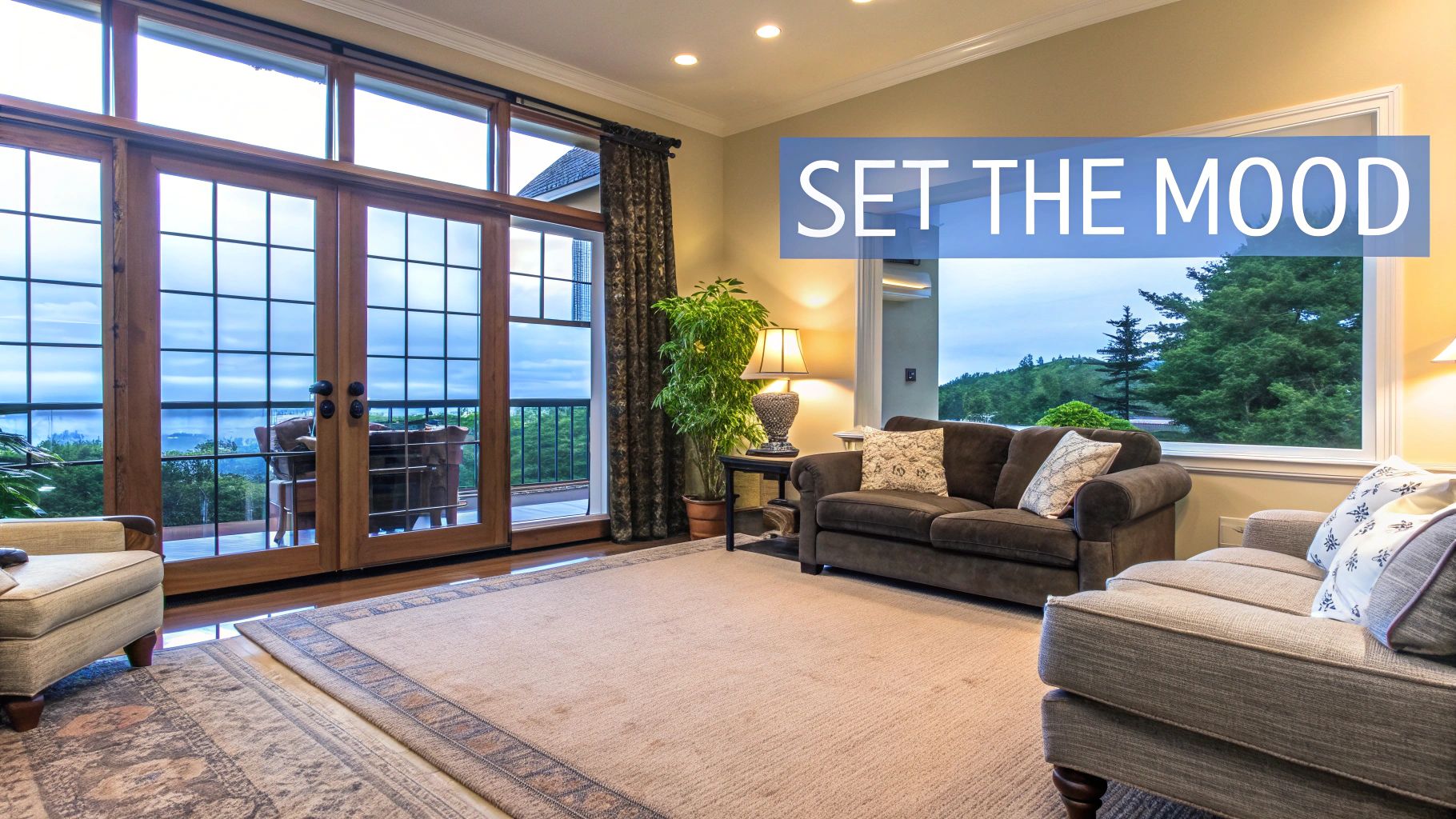
Choosing a paint color is one of the best parts of making a house feel like your home. It's about more than what’s trendy; it’s about crafting an atmosphere that genuinely fits your life.
The right hue can make a cozy room in White Marsh feel bright and spacious or turn a brand-new house in Edgewood into a warm, welcoming haven.
But with thousands of shades out there, where do you even start? It's easy to get overwhelmed. The key is a simple mental shift: instead of asking, "What color do I like?" ask, "What color does this room need?" This little change helps you see your space like a designer, focusing on what works before getting lost in personal favorites.
Thinking Beyond the Paint Chip
To land on a color you'll be happy with for years, you need a game plan. It’s all about seeing the bigger picture and understanding how all the pieces of the puzzle fit together.
Here are a few foundational things I always tell my clients to think about:
Your Home's "Fixed" Elements: Take a good look at the things you aren't changing anytime soon—your flooring, kitchen countertops, or that beautiful brick fireplace. For example, if your granite countertops have subtle flecks of gold, a wall color with a warm undertone will look fantastic. These elements all have undertones (the subtle colors within them) that your wall color needs to complement, not clash with.
The Room's Job: A bright, energetic color like a zesty orange might be fantastic for a kids' playroom but probably isn't the vibe you want for a relaxing primary bedroom where a calming blue-gray would be more fitting. Always think about the mood you want to create in that specific space.
The Flow of Your Home: Pay attention to how colors will transition from one room to the next, especially in the open-concept layouts we see so much in new homes across Baltimore and Harford County. A cohesive palette just makes a home feel more peaceful and put-together.
And remember, paint trends are about more than just aesthetics; they often reflect what's happening in the world. Decades ago, colors like avocado green and harvest gold were all about bringing nature inside. Today's popular palettes lean into wellness and comfort, with warm, rich tones that make a home feel like a true sanctuary.
Of course, picking the right color is only half the battle. To get that professional look, you'll want to check out these 9 Pro Paint and Decorating Tips for Flawless Results.
Selecting paint is the first step, but tying it all together with flooring, tile, and cabinets is where the magic happens. A great home should feel like a complete, personalized vision from the moment you walk in.
This journey is about more than just slapping some paint on the walls; it’s about making smart, cohesive choices that work in harmony. Learning https://www.customizeyourhome.com/post/how-to-customize-your-dream-home ensures every detail, from the walls to the floors, tells the same beautiful story. This is exactly what I help my clients do, offering hands-on service and visualizer tools to bring their ideas to life.
How Light Transforms Your Paint Color
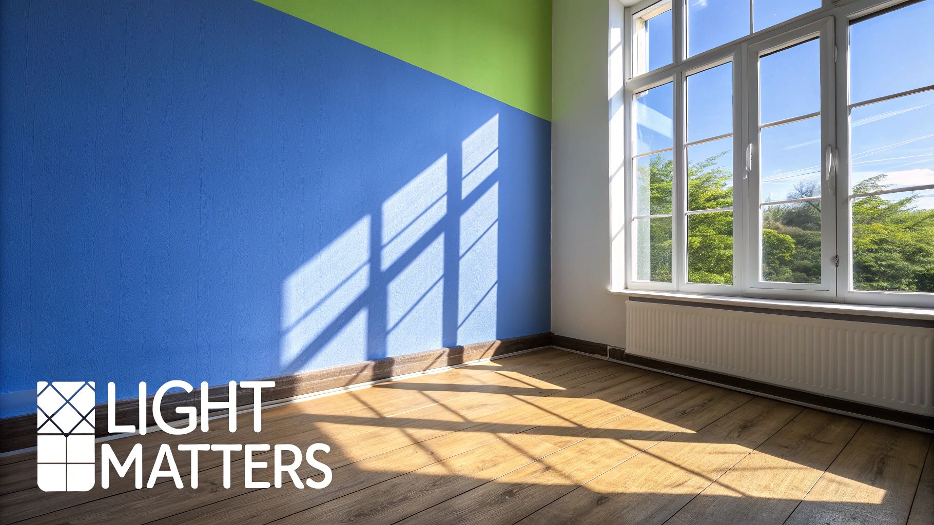
Have you ever picked the perfect paint chip at the store, rushed home to swatch it, and then stared in disbelief as it looked completely wrong on your wall? We've all been there. The culprit is almost always the lighting, which is hands down the most powerful—and most overlooked—factor in how a color actually looks in a room.
Think of light as an active ingredient in your paint. That soft, creamy beige you loved can look warm and inviting in one space but strangely drab and greenish in another. The secret is to stop fighting your light and start working with it. Once you understand how the light in your room changes throughout the day, you can pick a color that looks fantastic whether you're having your morning coffee or winding down at night.
Decoding Your Home's Natural Light
The sunshine pouring through your windows isn't one-size-fits-all. The direction a room faces fundamentally changes the color and temperature of the natural light, which in turn messes with how your paint color reads. This is a huge deal in Maryland homes, whether you're in a sun-drenched new house in White Marsh or a cozy, tree-lined classic in Baltimore County.
Let’s break down what you’re likely working with:
North-Facing Light: This is cool, indirect light that casts a subtle blueish tint. It’s incredibly consistent all day, which is great, but it can also make some colors feel a bit sterile. To counteract this, I often suggest a warmer greige or a creamy white to add coziness.
South-Facing Light: The holy grail for light lovers! This is bright, warm, yellowish light, especially in the middle of the day. It makes almost any color look incredible, though I’ve seen some very intense warm colors like a bold yellow become a bit too vibrant in a south-facing room.
East-Facing Light: You get that beautiful, clear, bright light in the morning, which fades into cooler shadows as the afternoon rolls in. A color that feels perfectly cheerful at 8 AM might seem a little gloomy by 4 PM, so you need a color you love in both settings. A versatile sage green is a great practical example that looks wonderful in both warm and cool light.
West-Facing Light: This is the opposite of an east-facing room. It’s softer in the morning and then gets bathed in a gorgeous, warm, almost coppery glow in the late afternoon and evening. That cozy evening light makes just about any color feel welcoming.
Here’s a little trick I tell my clients: create a "light map." Just watch how the sunlight moves across your walls during a full day. You might discover that the accent wall you were planning gets almost no direct light, which should absolutely influence your color choice.
Don't Forget Your Light Bulbs
The story doesn't end when the sun goes down. Your artificial lighting picks up right where natural light leaves off, and different bulbs cast wildly different glows.
Old-school incandescent bulbs, for instance, throw off a warm, yellow-amber light that makes reds and yellows pop but can seriously dull down blues and greens. On the flip side, many standard LED and fluorescent bulbs cast a cooler, bluer light that can make warm tones fall flat. This is precisely why you have to test your paint samples under your room's actual light fixtures at night, not just during the day.
While I help buyers customize their homes, getting the lighting and paint combination right from the very beginning is a total game-changer. I often use visualizer tools with my clients to show them exactly how different colors and sheens will react to the light in their specific floor plan. Taking this hands-on approach eliminates the guesswork and makes sure the final result is a home you will absolutely love walking into.
A Simple Guide to Home Color Theory
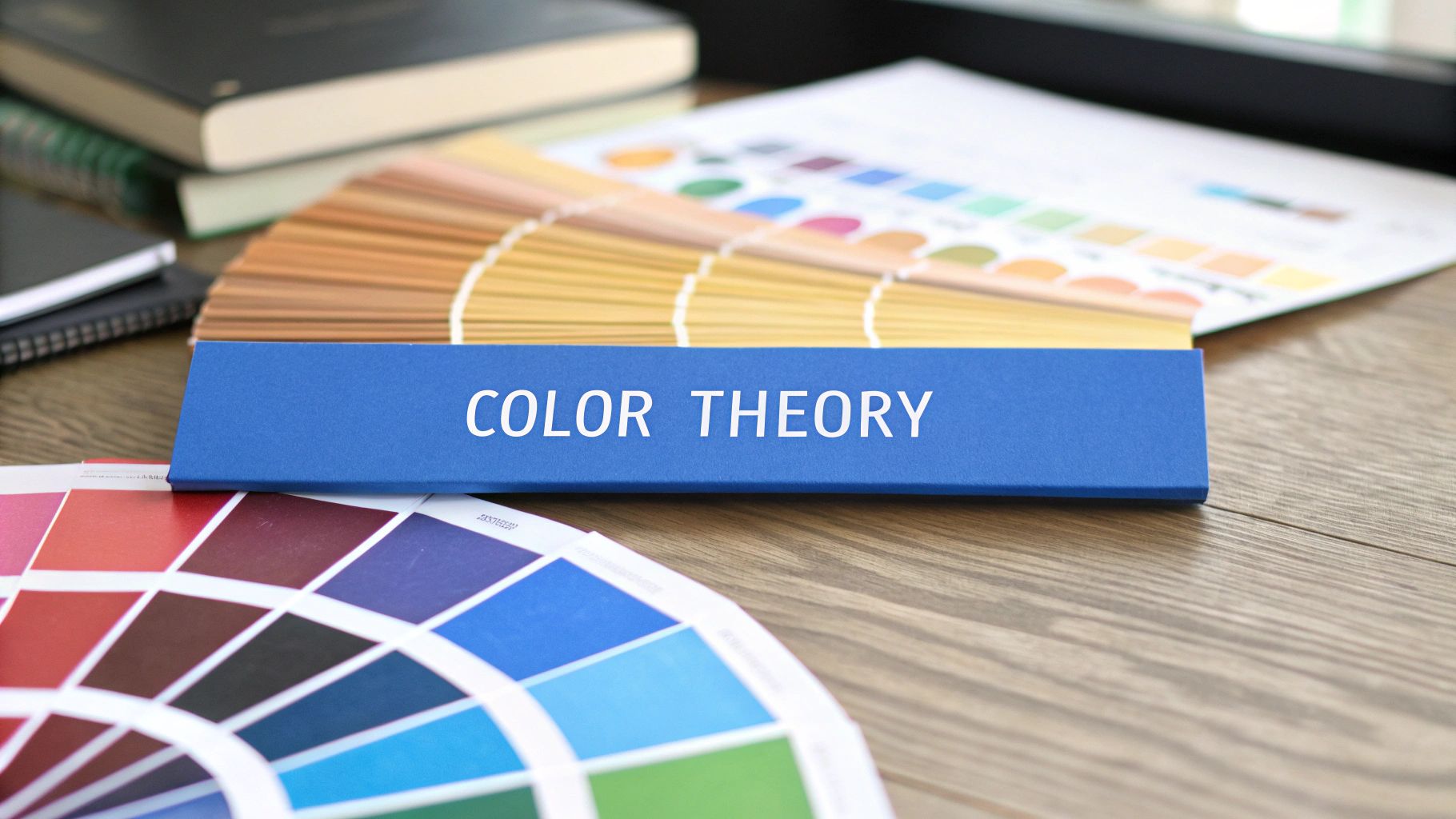
You absolutely do not need an art degree to pick a winning paint color. I promise. But knowing just a few basics of color theory will give you a massive confidence boost and help you understand why some colors just click.
Let's talk about the secret ingredient: undertones. These are the subtle colors hiding beneath the surface of a primary color, and they can make or break a room. Ever paint a wall gray only to have it look slightly purple in the afternoon light? Or choose a beige that suddenly feels a little too pink? That’s the undertone making its presence known.
A cool gray with blue undertones gives off a crisp, modern vibe. On the other hand, a warm "greige" with yellow or beige undertones feels instantly cozier. Spotting these undertones is the real pro move for creating a space that feels perfectly pulled together.
Using the Color Wheel in Your Home
That color wheel from elementary school art class? It's actually one of the most practical tools you can have when decorating. It’s your roadmap for building color palettes that feel intentional and harmonious, not accidental.
Here are a couple of my favorite, go-to approaches that my clients always love:
Monochromatic Schemes: This sounds fancy, but it just means you're using different shades and tones of a single color. Imagine a bedroom with soft, airy blue walls, a deep navy accent pillow, and trim painted a pale, almost-white blue. It creates this beautiful, layered look that feels incredibly sophisticated and calming.
Complementary Schemes: This one is for when you want a little more drama. It involves using colors that sit directly opposite each other on the color wheel. A perfect real-world example I've seen in a Harford County home is a deep blue accent wall in a living room with gorgeous, warm, orange-toned hardwood floors. That contrast makes both colors pop. It’s dynamic.
Don’t shy away from looking at trends for inspiration. They often capture a collective mood. For example, Pinterest tracks search data to see what colors people are loving, and a surge in searches for 'cherry red' or 'soft yellow' can tell us people are craving more optimism at home. You can explore the latest Pinterest Palette report to see what’s on the horizon.
Knowing these little tricks helps you get ahead of the curve. You can see what else is popular right now by checking out our guide on the top 10 home design trends for 2024.
When you’re personalizing a new home, these principles are gold. I love helping clients from White Marsh to Prince George's County use our visualizer tools to play with cabinet, flooring, and countertop color concepts. Seeing them confidently pair cabinet colors with countertop selections is the best part—they create a palette that is perfectly, uniquely them.
Test Paint Samples the Right Way
Let’s talk about those tiny, one-inch paint chips you get at the hardware store. They're practically useless for predicting how a color will actually look on your walls. Relying on them is hands-down the biggest mistake I see people make, and it’s the number one reason picking paint feels so overwhelming.
If you want to know if you'll truly love a color, you absolutely have to see a large swatch of it in your own space.
Now, whatever you do, don't just paint a splotch directly on your current wall. The color that’s already there will skew your perception and play tricks on your eyes, making the new sample look completely different than it actually is. The way the pros do it is by creating big, movable sample boards. This little trick gives you a real feel for the color and lets you see how it changes as you move it around the room.
Creating Your Test Boards
Grab a couple of foam boards or even just some large, white poster board. You're aiming for a decent size here—at least 2x2 feet.
Give each board two full coats of your sample paint, and make sure you let it dry completely between coats. I can't stress this enough: two coats are non-negotiable. This is the only way to see the color's true depth and richness, exactly as it will look when the job is done.
Once your boards are dry, the real test begins. Start moving them around the room at different times of the day.
This infographic really nails the process for doing it right.
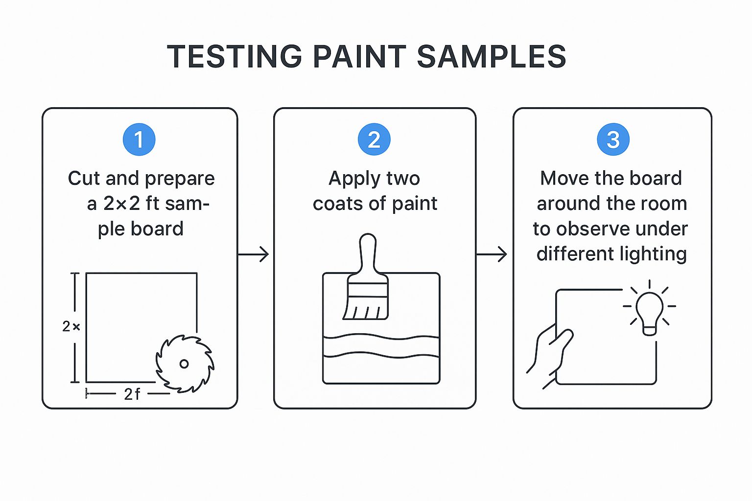
Think of this as your roadmap to avoiding a paint job you'll regret. A little prep work here saves a ton of heartache later.
But don't stop there. Get specific with your testing:
Check it against your trim. Prop the board right up against your window frames and baseboards. Does the new color make your white trim look crisp, or does it suddenly look dingy and yellow?
Compare it to the floor. Hold the sample down next to your carpet or hardwood. You might be surprised to see it pull out warm tones you never noticed in your wood, or worse, clash with the undertones in your tile.
View it next to your furniture. Place a board behind the sofa or next to a big bookshelf. The wall color needs to work with the major players in the room, not fight them.
The whole point is to see how the color interacts with every fixed element in your space. A color can look gorgeous in a vacuum but fall completely flat once it’s next to your warm oak floors or cool-toned granite countertops.
This hands-on method is exactly what I walk my clients through. We often take it a step further with visualizer tools that show how colors will look in their specific floor plan before committing. If you're curious about those digital options, our guide on home design software for beginners made simple is a great place to start.
Let's Tie It All Together: Matching Paint with Your Finishes
Think of your paint color as just one part of the bigger picture. It doesn't exist in a vacuum; it has to play nice with everything else in the room—your floors, your cabinets, even your countertops. Choosing a paint color is really about creating a cohesive vibe that makes the whole space feel connected and intentional.
So, where do you start? Look at what I call the "fixed finishes." These are the big-ticket items that aren't easy or cheap to swap out, like your flooring, tile work, and kitchen cabinetry. These elements have their own personalities and, more importantly, their own undertones. Your wall color needs to complement them, not clash with them.
Taking Cues from Your Surfaces
Your home's existing finishes are like a built-in cheat sheet for your color palette. They drop all the hints you need to pick a wall color that feels like it truly belongs.
For example, let's say your kitchen has gorgeous cherry wood cabinets. They naturally have warm, reddish-orange undertones. If you pair them with a paint that also has a warm base—think a creamy off-white or a warm, earthy gray—you'll create a rich, inviting atmosphere. On the other hand, throwing a stark, cool-toned gray on the walls next to those warm cabinets can make the whole room feel off-balance and disconnected.
Here’s how this plays out in real life:
Working with Warm Tones: You've got classic oak hardwood floors with that beautiful golden-yellow glow. A soft sage green or a warm greige on the walls will play up the warmth of the wood perfectly.
Leaning into Cool Tones: Maybe your bathroom has Carrara marble counters with those elegant cool gray and blue veins running through them. A crisp, light blue, a soft gray with blue undertones, or even a dramatic charcoal will make that beautiful stone the star of the show.
It's all about creating that visual harmony. Making these foundational choices can feel daunting, which is why we put together a guide on how to choose flooring for your new home. And since countertops are another huge piece of the puzzle, this article on selecting the right countertops for your aesthetic vision is an incredible resource.
A Designer's Secret Weapon: The 60-30-10 Rule
If you’re feeling overwhelmed, let me introduce you to a classic design principle that never fails: the 60-30-10 rule. It's a dead-simple formula for getting your color balance just right.
60% is your main color. This is usually the color you put on your walls. It’s the foundation that sets the mood for the entire room.
30% is your secondary color. This is where your furniture, curtains, or maybe an accent wall come in. It needs to support the main color but have enough personality to add some interest.
10% is your accent color. This is the fun part! It’s your pop of color for smaller items like throw pillows, artwork, and decorative objects.
Let’s break it down with a practical example. Imagine a living room with soft, neutral greige walls (60%). The sofa and chairs are a deep navy blue (30%), providing a solid anchor. Then, you sprinkle in a vibrant mustard yellow (10%) through a couple of pillows and a vase on the mantle. See? Balanced and beautiful.
This simple rule removes all the guesswork. When I'm helping clients in White Marsh or Edgewood design their homes, we use our visualizer tools to apply this very principle. It lets us see exactly how the paint, flooring, and cabinet choices will come together to create a space that’s not just stunning, but uniquely theirs.
Making Your New Maryland Home Truly Yours
Picking out cabinets, flooring, countertops, tiles and backsplash is, hands down, one of the best parts of personalizing a new house. It's where the space really starts to feel like yours. While many builders provide high-quality homes, I go a step further by offering my clients unique customization tools that truly bring their dream space to life. Your home should reflect who you are the second you walk through the door.
That's why I do things a bit differently. I give my clients the freedom to pick out their dream flooring, countertops, cabinets, and tile. And, of course, after moving in and finding the perfect paint colors to pull it all together. It’s all about creating a cohesive look that feels just right for you and your family.
Visualize It Before We Paint a Single Wall
I know it can be tough to imagine how everything will look once it's all in place. To take the guesswork out of the equation, I give my clients access to some really cool visualizer tools. These aren't just generic room mockups; you can see exactly how different paint colors will look in your specific floor plan, right alongside the finishes you've already selected.
My goal is simple: to make sure that when you move into your beautiful new home in a community like White Marsh, Edgewood, or anywhere else in Baltimore County and Harford County, it feels like it was designed just for you.
We can play around with different combinations—see how that soft greige looks with your quartz countertops or test out a dramatic accent wall in the living room. It's a collaborative, hands-on process. Let's work together to build a home that's not just new, but is a perfect reflection of you from day one.
Common Paint Color Questions I Get Asked All the Time
Over the years, I've heard just about every question you can imagine when it comes to picking paint. These are a few of the ones that come up again and again with clients selecting finishes for their new homes, and the answers can save you a lot of second-guessing.
What’s the Secret to a Whole-House Color Palette?
The trick is to start with a single, go-to neutral that you can splash across all your main living areas and hallways. This is what creates that seamless, connected feel as you walk through the home. I often recommend a flexible greige or a warm off-white, especially for homes in places like White Marsh, Edgewood, or anywhere in Prince George's County where the natural light can shift throughout the day.
Once you have that anchor color, you can build out a supporting palette of three to five other colors. These are the shades you’ll pull from for bedrooms, the home office, or a powder room, ensuring everything feels related but not identical.
My Favorite Trick: Get physical with it! Don't just rely on your phone screen. Go grab your paint chips, a spare piece of flooring, a cabinet door sample, and even a throw pillow from the sofa. Laying everything out together is the only way to truly see if the colors vibe before you start painting.
Does the Paint Finish (Matte, Eggshell, etc.) Really Matter?
Oh, absolutely. The finish—or sheen—you choose has a huge impact on both the look and the lifespan of your paint job. It's not just about looks; it's about practicality.
Matte: This is your best friend for hiding little bumps and imperfections on a wall because it has zero shine. It's perfect for ceilings and low-traffic rooms, like a formal dining room or a primary bedroom.
Eggshell & Satin: These are the workhorses of the paint world. They have just a hint of a glow, which makes them way easier to wipe down. I almost always recommend one of these for busy hallways, family rooms, and kids' bedrooms.
Semi-Gloss: With a much more noticeable shine, this finish is built to last. It stands up to moisture and scrubbing, making it the clear winner for trim, doors, and demanding spaces like kitchens and bathrooms.
Help! How Do I Pick Paint for My Open Floor Plan?
Painting an open-concept space can feel intimidating, but the goal is to create harmony without being monotonous. The simplest way to do this is to pick one primary color for the majority of the walls. This immediately makes the entire area feel bigger and more unified.
But unified doesn't have to mean boring! You can add personality by creating "zones." Paint an accent wall behind your dining table or in a small reading nook with a slightly bolder, but still complementary, color. For a practical example, if your main walls are a soft greige, a deep navy accent wall in the dining area can create a sophisticated, defined space without closing it off.
Ready to stop guessing and start designing with confidence? At Customize Your Home, I offer hands-on guidance and access to visualizer tools that show you exactly how your paint, flooring, and cabinet selections will come together in your new Maryland home. Let’s make your vision a reality. https://www.customizeyourhome.com
Comments